Speak the Text Alfred UI Tutorial
Let's create a simple UI where you can type text and have it spoken aloud.
Speak the Text
A text area to speak what you type
Workflow Setup
Create a new blank workflow. Add a Keyword Input and an Alfred UI object, then connect the former to the latter.
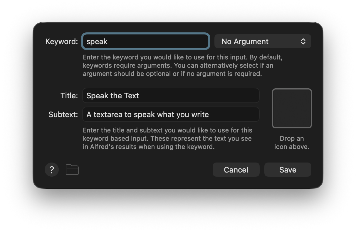
Configure the Keyword Input first. Make the Keyword, Title, and Subtext whatever you like but ensure the argument handling is set to No Argument.
Configure the Alfred UI object next. Set a name for the Alfred UI file and click the +.
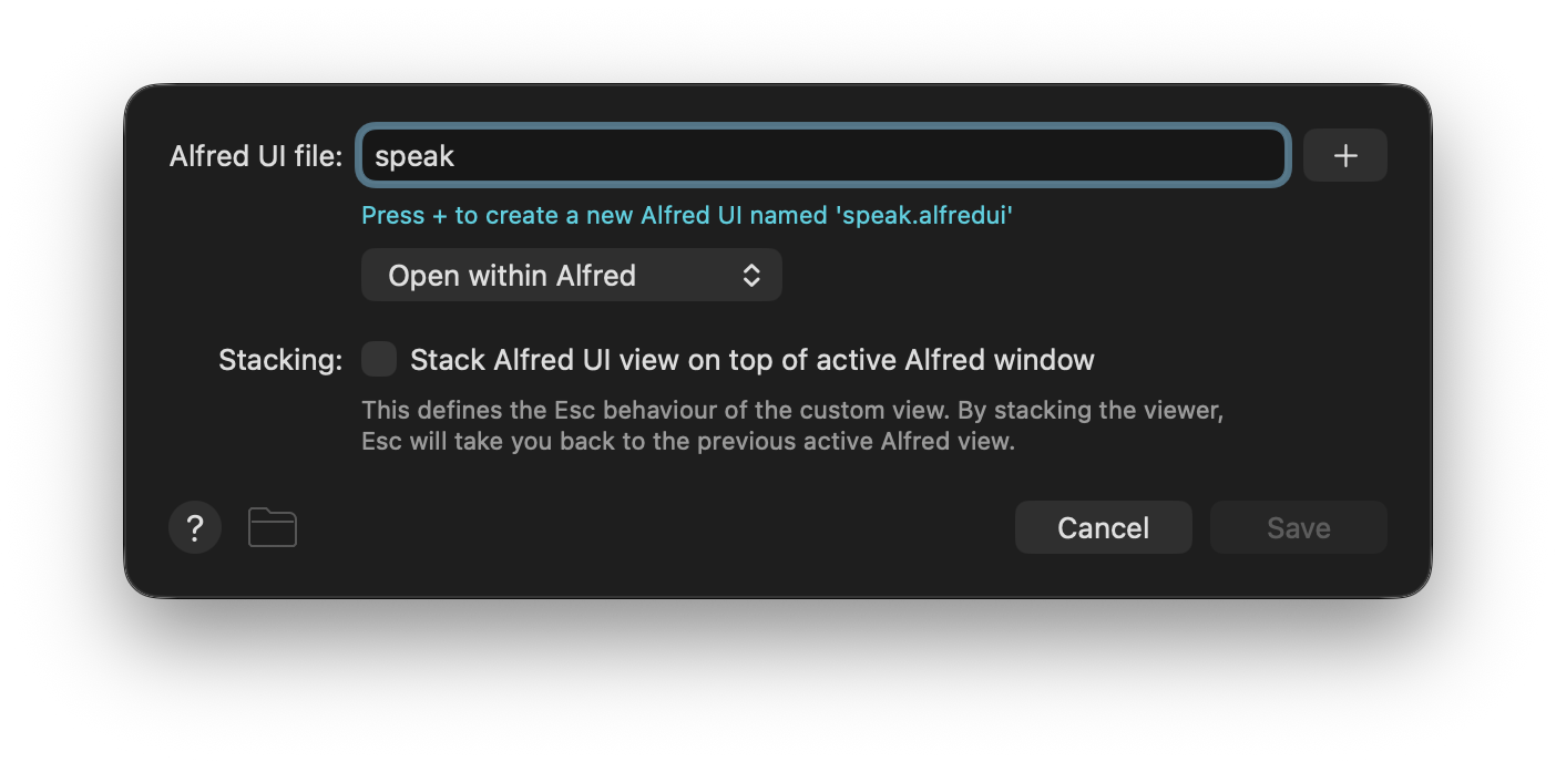
You can now click the ... to open the the .alfredui package in the Finder or Terminal. Open the ui.json file in your favourite text editor and let's get started making our UI.
TipYou can create the
.alfreduifolder andui.jsonfiles manually, though doing so through the interface sets you up with the default template.
In the interest of pedagogy, delete the contents of the ui.json file so we can add back just what we need and explain as we go.
Building the UI
NoteRefer back to previous tutorials for further detail on some concepts discussed here. Despite focusing on distinct stand-alone UIs, tutorials are designed to be followed in order.
Laying Out a Border View
Here we add a window with a border layout. For its components we have a textarea and a button.
{
  "window": {
    "size": { "height": 400 },
    "padding": 8,
    "root": {
      "type": "view",
      "layout": "border",
      "components": [
        {
          "type": "textarea",
          "text": "Hello, this is Alfred UI"
        },
        {
          "type": "button",
          "text": "Speak the Text"
        }
      ]
    }
  }
}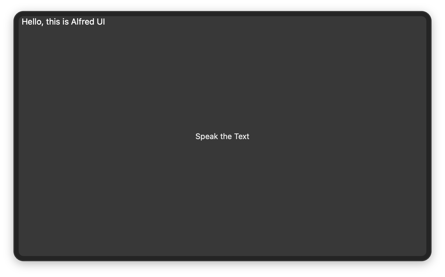
We have something, but it looks different from what we expected. While some layouts place their components in the order defined in the array, the Border Layout requires you to specify the region of each component in their constraints. Let's do that.
{
  "window": {
    "size": { "height": 400 },
    "padding": 8,
    "root": {
      "type": "view",
      "layout": "border",
      "spacing": 8,
      "components": [
        {
          "constraints": { "region": "centre" },
          "type": "textarea",
          "text": "Hello, this is Alfred UI"
        },
        {
          "constraints": { "region": "bottom" },
          "type": "button",
          "text": "Speak the Text"
        }
      ]
    }
  }
}
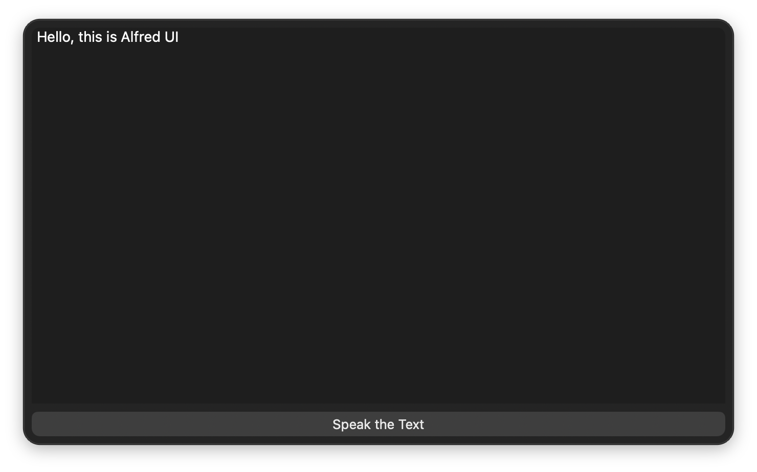
Success! The button is placed on the bottom region, spanning the width and taking up just enough space to fit its height. The textarea is assigned to the centre, filling the remaining available area. We have also added a bit of spacing between them.
Connecting the Button
Let's add events and action to make the button work. Specifically, we'll use the JSON Action command to speak text.
{
  "window": {
    "size": { "height": 400 },
    "padding": 8,
    "root": {
      "type": "view",
      "layout": "border",
      "spacing": 8,
      "components": [
        {
          "constraints": { "region": "centre" },
          "id": "textforspeak",
          "type": "textarea",
          "text": "Hello, this is Alfred UI"
        },
        {
          "constraints": { "region": "bottom" },
          "type": "button",
          "text": "Speak the Text",
          "events": [
            {
              "trigger": "actioned",
              "action": {
                "variables": { "sentence": "{value:textforspeak.text}" },
                "type": "json",
                "src": { "speak": { "text": "{var:sentence}" } }
              }
            }
          ]
        }
      ]
    }
  }
}
Because the button's action needs to get data from the textarea (a separate component), we added an id to the latter so we can refer to it and extract its text.
Functionally, we're done. You can now type anything into the box and click the button to have it spoken aloud.
Read on to see how we can improve the experience in simple ways, only requiring one line each.
Improving Usability with Shared Properties
Components have a number of properties specific to themselves, and others which are shared.
Have you noticed that so far you had to click the textarea every time you start the workflow, for it to take your input? How about having to always use the cursor to click the button?
We can solve the former by setting the textarea's focus to true so that it becomes active when it's ready. For the latter, we add a keyboard shortcut to the button, and make note of it in its tooltip.
{
  "window": {
    "size": { "height": 400 },
    "padding": 8,
    "root": {
      "type": "view",
      "layout": "border",
      "spacing": 8,
      "components": [
        {
          "constraints": { "region": "centre" },
          "id": "textforspeak",
          "type": "textarea",
          "text": "Hello, this is Alfred UI",
          "focus": true
        },
        {
          "constraints": { "region": "bottom" },
          "type": "button",
          "text": "Speak the Text",
          "shortcut": "⌘T",
          "tooltip": "Speak the Text ⌘T",
          "events": [
            {
              "trigger": "actioned",
              "action": {
                "variables": { "sentence": "{value:textforspeak.text}" },
                "type": "json",
                "src": { "speak": { "text": "{var:sentence}" } }
              }
            }
          ]
        }
      ]
    }
  }
}
With the above, we have our Text to Speak UI!