Text to Markdown Alfred UI Tutorial
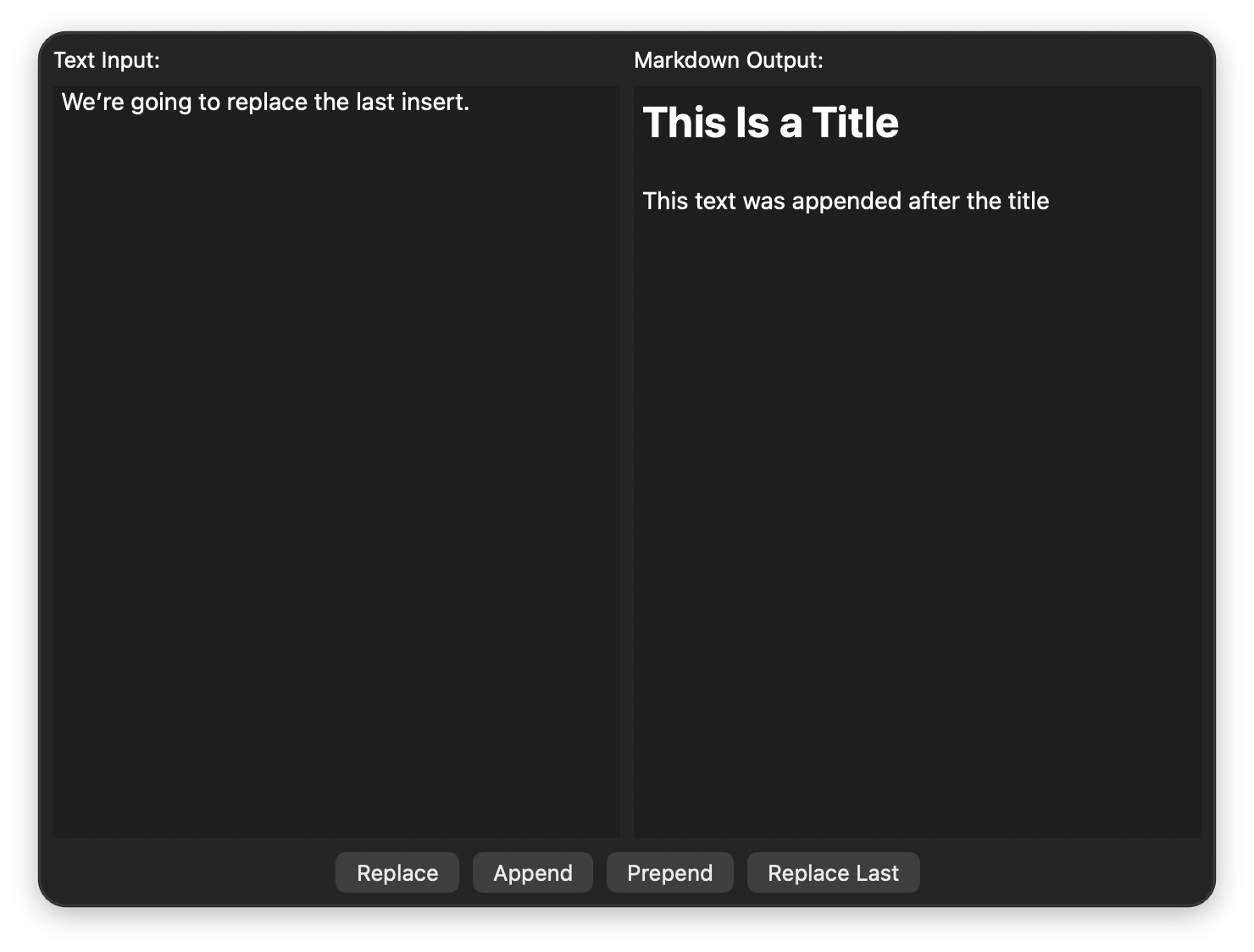
Let's create a modular UI where you type text and trigger changes to a markdown area.
Text to Markdown
Replace, append, and prepend text to rendered markdown
Workflow Setup
Create a new blank workflow. Add a Keyword Input and an Alfred UI object, then connect the former to the latter.
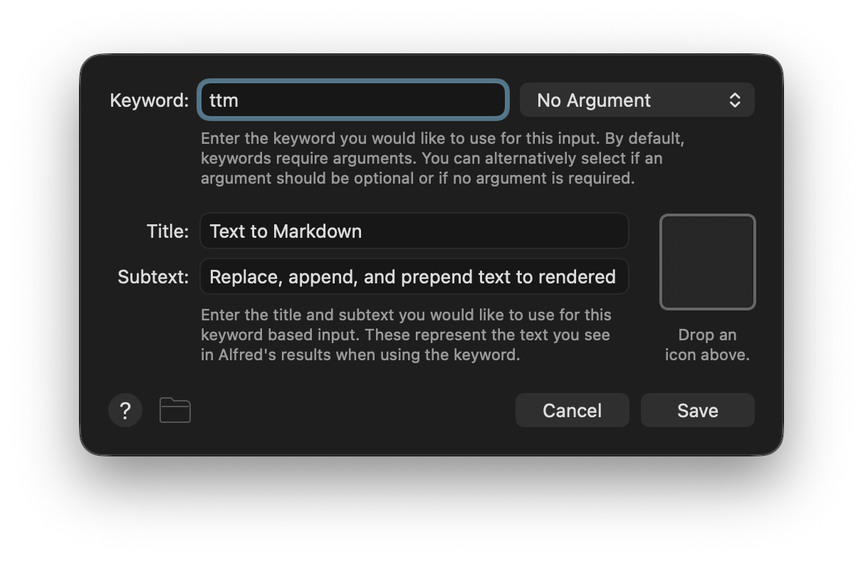
Configure the Keyword Input first. Make the Keyword, Title, and Subtext whatever you like but ensure the argument handling is set to No Argument.
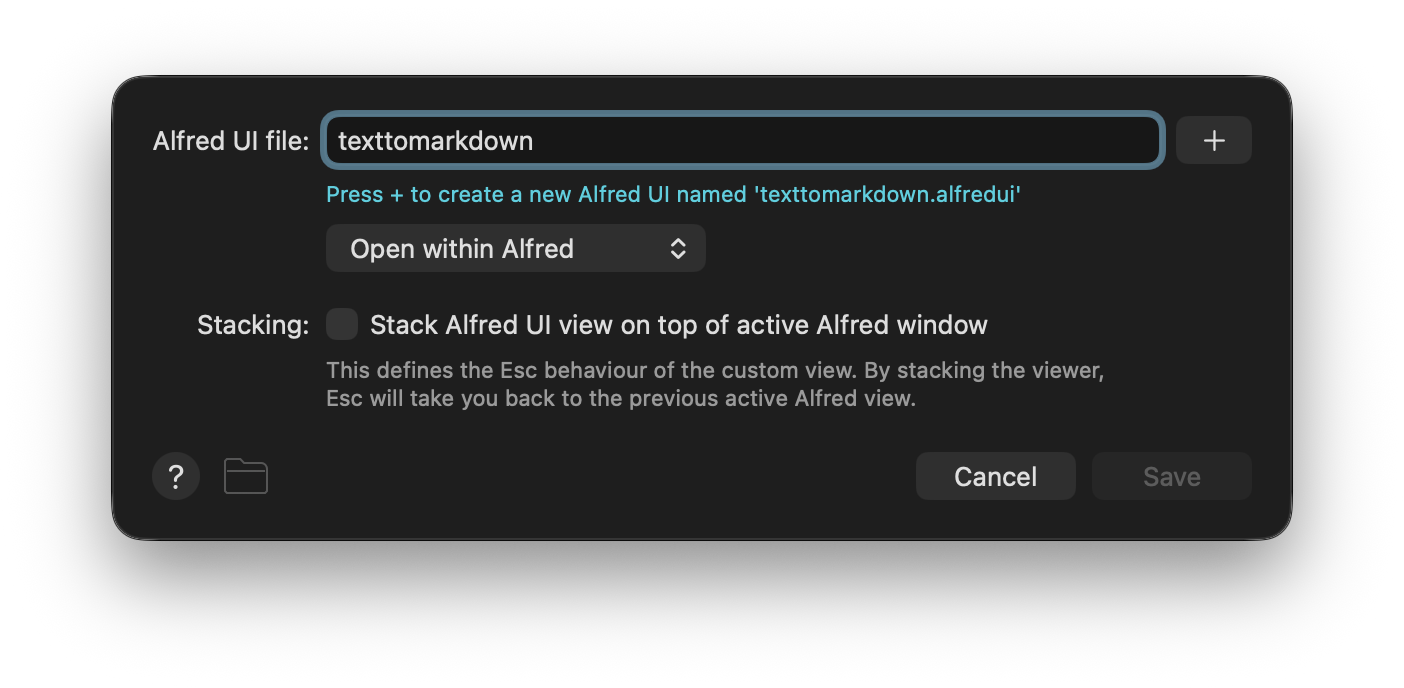
Configure the Alfred UI object next. Set a name for the Alfred UI file and click the +.
You can now click the ... to open the the .alfredui package in the Finder or Terminal. Open the ui.json file in your favourite text editor and let's get started making our UI.
TipYou can create the
.alfreduifolder andui.jsonfiles manually, though doing so through the interface sets you up with the default template.
In the interest of pedagogy, delete the contents of the ui.json file so we can add back just what we need and explain as we go.
Building the UI
NoteRefer back to previous tutorials for further detail on some concepts discussed here. Despite focusing on distinct stand-alone UIs, tutorials are designed to be followed in order.
Expanding the File Structure
This time we'll break down our UI into several files. Inside the .alfredui package make a new folder called components and add four files to it: buttons.json, buttontemplate.json, markdown.json, and textarea.json.
texttomarkdown.alfredui
 ├─ ui.json
 └─ components/
     ├─ buttons.json
     ├─ buttontemplate.json
     ├─ markdown.json
     └─ textarea.json
Laying Out the Outer View
We start by editing ui.json, adding a window with a border layout. For its components, we have a grid layout and... Something else.
ui.json
{
  "window": {
    "padding": 8,
    "size": { "height": 500 },
    "root": {
      "type": "view",
      "layout": "border",
      "spacing": 8,
      "components": [
        {
          "constraints": { "region": "centre" },
          "type": "view",
          "layout": "grid",
          "spacing": 8,
          "rows": 1,
          "cols": 2,
          "components": [
            "{file:components/textarea.json}",
            "{file:components/markdown.json}"
          ]
        },
        "{file:components/buttons.json}"
      ]
    }
  }
}
Two new concepts were introduced above. The first is compositing views. Note how there is a grid inside a border - layouts are components too! This is how you should think about your UIs: units which break down into smaller nested segments.
The second concept is the {file:} placeholder. It replaces itself with the contents of the referenced file. Let's add those files next.
Populating the Grid
We want two areas of equal size next to each other, which is why our grid has two colums but a single row. Inside each grid item we see another border layout (remember: compositing views) with two regions.
textarea.json
{
  "type": "view",
  "layout": "border",
  "spacing": 8,
  "components": [
    {
      "constraints": { "region": "top" },
      "type": "label",
      "text": "Text Input:"
    },
    {
      "constraints": { "region": "centre" },
      "id": "rawinput",
      "type": "textarea",
      "focus": true
    }
  ]
}
markdown.json
{
  "type": "view",
  "layout": "border",
  "spacing": 8,
  "components": [
    {
      "constraints": { "region": "top" },
      "type": "label",
      "text": "Markdown Output:"
    },
    {
      "constraints": { "region": "centre" },
      "id": "markdown",
      "type": "markdownarea",
      "behaviour": { "scroll": "auto" }
    }
  ]
}
We've seen most of that in previous tutorials, including the textarea, but there are two new components too.
A label is static, read-only text. Pretty self-explanatory; you use it to display short bits of text.
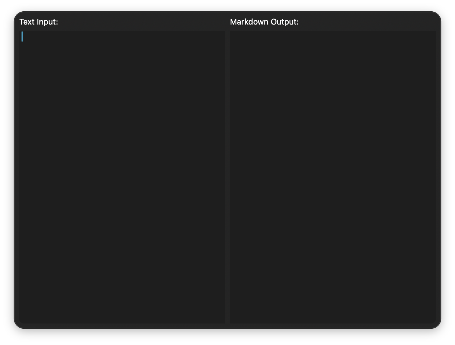
The markdownarea looks similar to the textarea at first glance (try running your workflow now), but you'll soon see it's a different beast.
Adding the Buttons
Every button has a related function, so we can turn to templates once more. But before we do, let's make a single one to think about our approach.
{
  "type": "button",
  "text": "Replace",
  "events": [
    {
      "triggers": "actioned",
      "action": {
        "type": "json",
        "variables": { "outputtext": "{value:rawinput.text}" },
        "src": {
          "update": {
            "ids": {
              "markdown": {
                "behaviour": { "mode": "replace" },
                "text": "{var:outputtext}"
              },
              "rawinput": {
                "text": ""
              }
            }
          }
        }
      }
    }
  ]
}
A button firing an event when actioned should look fairly familiar by now, but the JSON Action command to update the UI is new. Be mindful of it, as you're bound to use it a lot - updating components in response to events is the backbone of interactivity.
At its core we're doing nothing more than defining new values for specific keys in select components (targeted by their id). We set the text of the textarea (rawinput ID) to an empty string to clear it, while at the same time using what was there as the text of the markdownarea (markdown ID). On the latter we also set a behaviour mode, which allows us to play with the markdown contents. Instead of explaining what each mode does, it's best if you try them yourself. Edit the remaining files and run the workflow.
buttons.json
{
  "constraints": { "region": "bottom" },
  "type": "view",
  "layout": "inline",
  "spacing": 8,
  "components": [
    {
      "type": "template",
      "src": "components/buttontemplate.json",
      "params": {
        "buttontext": "Replace",
        "textmode": "replace"
      }
    },
    {
      "type": "template",
      "src": "components/buttontemplate.json",
      "params": {
        "buttontext": "Append",
        "textmode": "append"
      }
    },
    {
      "type": "template",
      "src": "components/buttontemplate.json",
      "params": {
        "buttontext": "Prepend",
        "textmode": "prepend"
      }
    },
    {
      "type": "template",
      "src": "components/buttontemplate.json",
      "params": {
        "buttontext": "Replace Last",
        "textmode": "replacelast"
      }
    }
  ]
}
Note how we're placing the buttons with a simple inline layout, ideal to arrange components next to each other accross one axis.
buttontemplate.json
{
  "type": "button",
  "text": "{param:buttontext}",
  "events": [
    {
      "triggers": "actioned",
      "action": {
        "type": "json",
        "variables": { "outputtext": "{param:outputtext}" },
        "src": {
          "update": {
            "ids": {
              "markdown": {
                "behaviour": { "mode": "{param:textmode}" },
                "text": "{var:outputtext}"
              },
              "rawinput": {
                "text": ""
              }
            }
          }
        }
      }
    }
  ]
}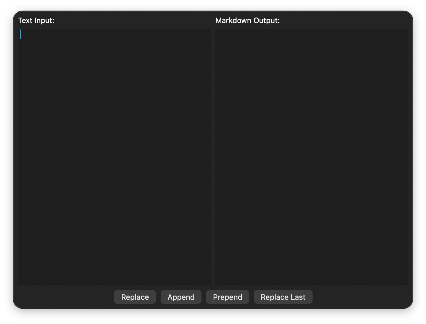
There you have it, our complete interface. Type some markdown and try the different mode buttons.