Web Browser Alfred UI Tutorial
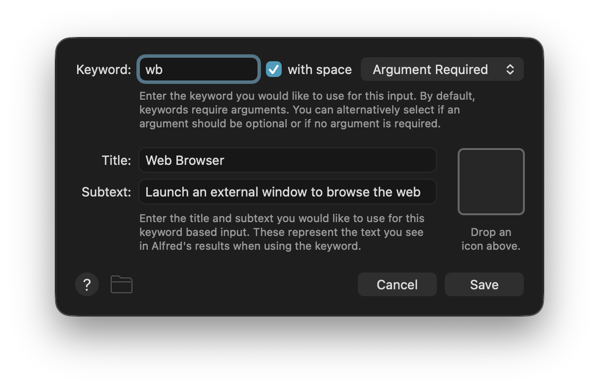
Let's create an external window to browse the web.
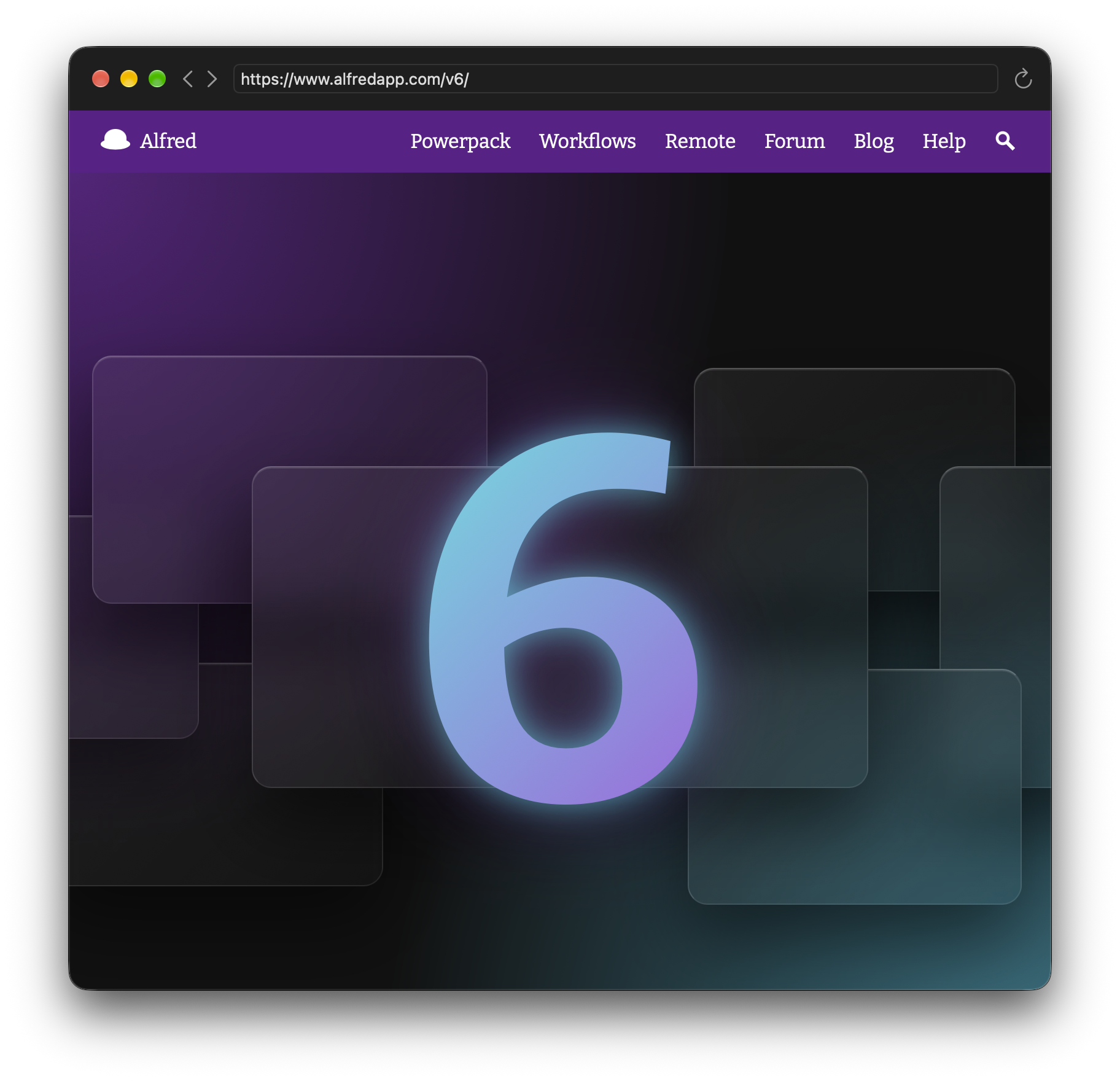
Yes, Alfred UI allows you to have multiple workflows open as apps! You can move them around, resize them, maximise, minimise, Split View in fullscreen...
Web Browser
Launch an external window to browse the web
Workflow Setup
From now on, download the finished workflow and inspect the .alfredui. Its structure will be familiar by now, so we'll only cover interesting new bits.
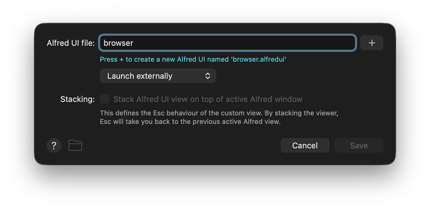
On the outside we still have a Keyword Input connected to an Alfred UI object, but this time we leave the argument handling on the Keyword Input as Argument Required and set the Alfred UI object to Launch externally.
Building the UI
NoteRefer back to previous tutorials for further detail on some concepts discussed here. Despite focusing on distinct stand-alone UIs, tutorials are designed to be followed in order.
Introducing Variables
Historically, variables in Alfred had to be limited to being strings because they have to be passed around as environment variables to be understood by any programming language. When defining variables in Alfred UI's JSON, that restriction need not apply. This means we can define entire components and properties as variables for reuse.
This time, though, we'll cover something more dynamic.
ui.json
"variablesconfig": {
  "url": { "src": "args[0]" }
},
You'll find variablesconfig in ui.json as a sibling of window. It's a more powerful version of the variables key, allowing for addtional configuration such as defaults, persistence, availability in scripts and, for our purposes, reading values upstream from the workflow.
With "url": { "src": "args[0]" }, we assign the first argument passed to the Alfred UI object (i.e. what you type when actioning the Keyword Input) to the variable url, to be read and overriden later.
Customising the Window
ui.json
"window": {
  "title": "Alfred UI Web Browser",
  "titlevisibility": false,
  "titlebarappearstransparent": true,
  "fullsizecontentview": true,
  "toolbar": { "type": "unified" },
  "size": {
    "width": 800,
    "height": 800
  },
Lots of new things to explore in window options. Let's look at them one by one. First, with nothing set.

By default we see a window with a title bar and the title "Alfred UI". Let's be more specific.
"title": "Alfred UI Web Browser",
Now let's hide it.
"titlevisibility": false,
This may seem like a strange thing to do, but even if your window's title isn't visible, it is still good practice to set it. This will allow, for example, for the window to be identified more easily by AppleScript or accessibility software.
It does look weird seeing the edge of the bar with no title, so let's get rid of that too.
"titlebarappearstransparent": true,
It's beginning to look like what we want. Extend the content up to the top.
"fullsizecontentview": true,
Finally, make it a toolbar.
"toolbar": { "type": "unified" },
As you can see, there’s a lot of freedom. We merely scratched the surface of the available window properties.
The final section, size, will be familiar from previous tutorials. Except this time we added a width as well.
Registering Global Shortcuts
ui.json
"shortcuts": [
  {
    "shortcut": "⌘L",
    "action": {
      "type": "json",
      "src": {
        "update": { "ids": { "addressbar": { "focus": true } } }
      }
    }
  }
],
We've added them to buttons before, but shortcuts can also be set on views and be triggered whenever it or its children are in focus. By setting shortcuts at the root, they work regardless of where we are in the UI as long as the window is frontmost.
You may recognise ⌘L as a standard key combo to focus the address bar in web browsers.
Inserting the Web View
Setting up a webkitview is as simple as:
{
  "type": "webkitview",
  "src": "https://www.alfredapp.com"
}
That's it, two lines. And the second one isn't strictly necessary. But for our web browser we of course want more.
browser.json
{
  "constraints": { "region": "centre" },
  "id": "webview",
  "type": "webkitview",
  "src": "{var:url}",
  "events": [
    {
      "triggers": "changed",
      "action": {
        "variables": {
          "url": "{value:self.src}"
        },
        "type": "json",
        "src": {
          "update": { "ids": { "addressbar": { "text": "{var:url}" } } }
        }
      }
    }
  ]
}
id is there so we can control the web view later with the toolbar buttons.
src uses the url variable we set up at the start. This makes the web view immediatelly load the argument passed in by the Keyword Input.
The last bit to mention is the event. Whenever the web view changes ("triggers": "changed"), we update the address bar to match. This way it always shows the current URL we've visiting, even after redirects. We are also updating the value of the url variable accross the workflow.
TipWe can use
"{value:self.src}"to get the current web address because the event is part of the web view."{value:webview.src}"would be identical, aswebviewis the relevantid.
Setting Up the Navigation Bar
Opening up navbar.json, you may immediatelly notice "insets": { "left": 78 } under constraints and realise how the components of the navigation bar got that gap to the left. Change the value or remove the property to see how it affects the UI.
Use insets judiciously. You can do a lot by letting the auto-layout do it's work then adding consistent breathing areas around and within views with padding and spacing.
To lay out the components of the navigation bar, we use a border layout with a left, centre, and right regions. We have backwards and forwards buttons on the left, inside an inline layout; a reload button to the right; and the adress bar at the centre, expanding to fill the remaining available space.
For the address bar we use a textfield.
navbar.json
{
  "constraints": { "region": "centre" },
  "id": "addressbar",
  "type": "textfield",
  "textinsets": { "horizontal": 4 },
  "events": [
    {
      "triggers": "actioned",
      "action": {
        "variables": {
          "url": "{value:self.text}"
        },
        "type": "json",
        "src": {
          "update": { "ids": { "webview": { "src": "{var:url}" } } }
        }
      }
    }
  ]
},
It has a small horizontal text inset for a more balanced look.
The event is again worth mentioning. "triggers": "actioned" on a text field fires when you ↩ on it. In our case it causes the web view to update to the new address, which is exactly what we want.
TipOn
multilinetext fields use ⌥↩ or ⇧↩ to insert a new line without actioning. Always consider first if atextareawould be more appropriate, as more often than not it will be.
Last thing left to cover are the additions to the buttons. We'll look at the one for reloading.
navbar.json
{
  "constraints": { "region": "right" },
  "type": "button",
  "tooltip": "Refresh ⌘R",
  "shortcut": "⌘R",
  "bordered": false,
  "font": { "size": 16 },
  "image": {
    "type": "symbol",
    "src": "arrow.clockwise"
  },
  "events": [
    {
      "trigger": "actioned",
      "action": {
        "type": "function",
        "src": "webview",
        "args": "reload"
      }
    }
  ]
}
bordered is set to false to remove the button's border, while font tweaks its size. Unlike previous tutorials, this time it has an image as opposed to text. Specifically, it's the name of an SF Symbol.
"image": {
  "type": "symbol",
  "src": "chevron.left"
},TipTo discover SF Symbols' names, use the official Apple app or the SF Symbols Browser workflow.

ImportantProperties like
imageandfontare not available on every component. You can see they are present in buttons by reading the documentation.
Finally, the action.
navbar.json
"action": {
  "type": "function",
  "src": "webview",
  "args": "reload"
}
Up until now have been focusing on "type": "json" to trigger bespoke changes, but this time we want to trigger an action specific to the component. We set it to "type": "function", use the web view's id as the src, then call functions specific to this component on the args.
With that, we covered everything you need to create a simple web browser UI in just a few kilobytes!